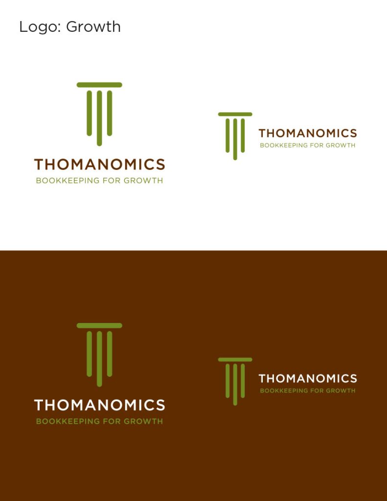
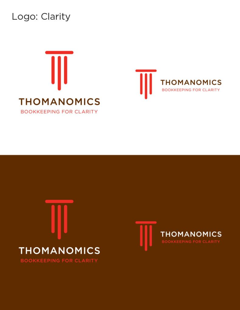
Shawna Thomas is a master accountant with years of experience with building contractors and other trades. In our initial consultation, she expressed that what she brings to her clients is clarity and a strategy for growth.
The symbol is the letter “T” rendered as a column. Trust is exceedingly important when someone opens their books to you, and the column conveys that.
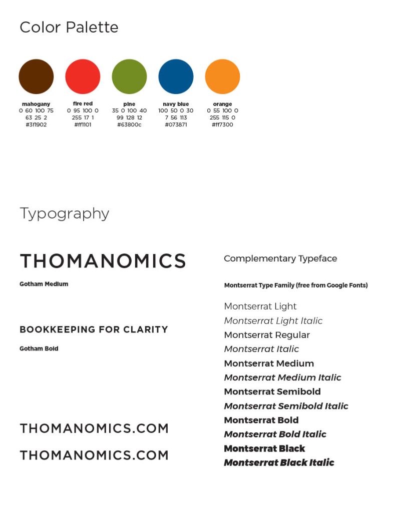
Her colors include green for growth, red for clarity, and deep mahogany brown. Now normally you don’t want red associated with accounting. That’s one aspect making this palette so bold and innovative. We don’t have another blue and black logo like every other accounting firm.
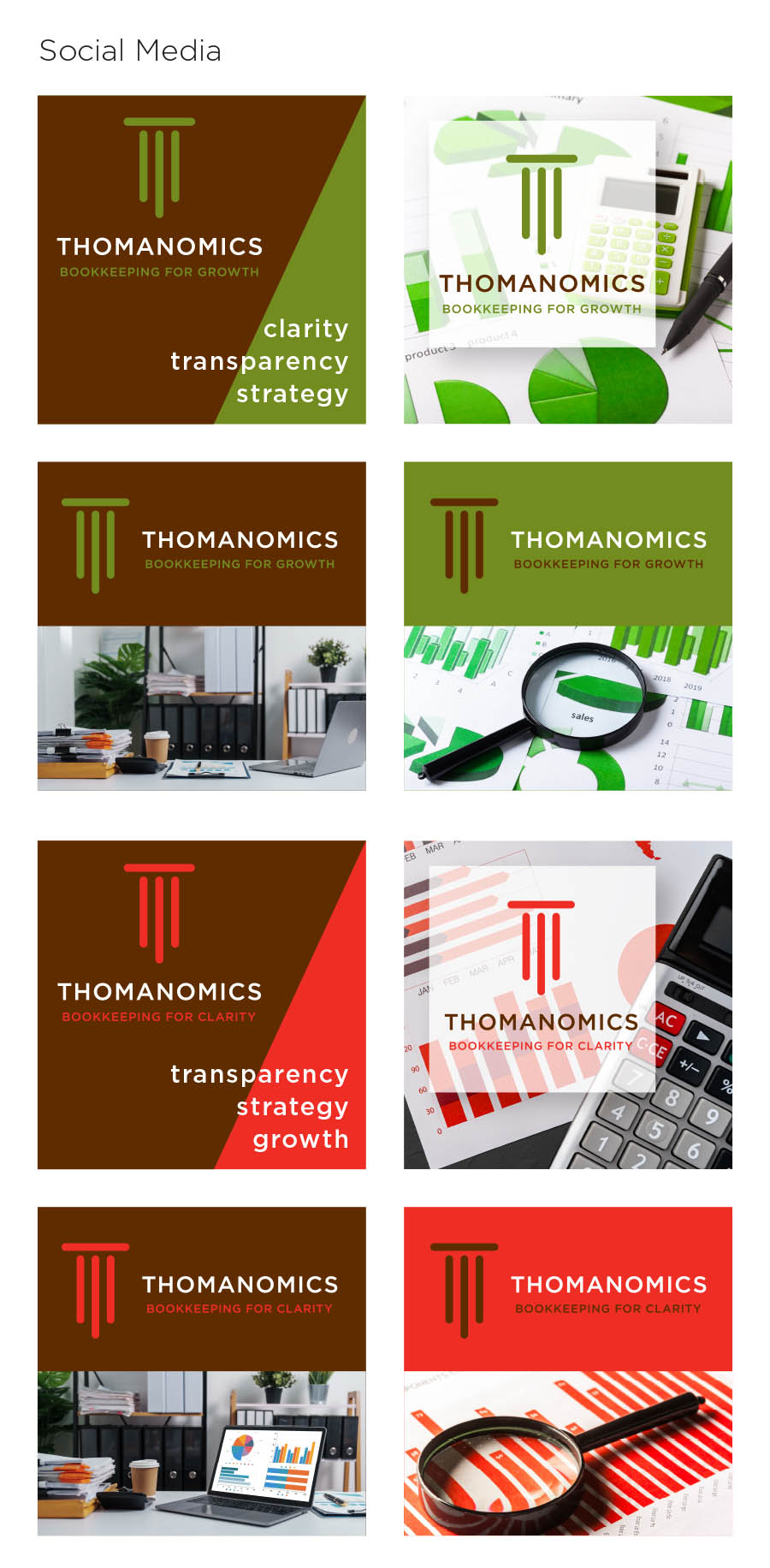
As part of the full Studio 2D branding package, she received the logo in a number of variations and formats, an icon, social media banner, post images, and business cards.
She had business cards printed in both colors, which is fun, and she can let people choose their favorite. Repurposing the social media ads for print was a snap, and a clear advantage to having the whole package from the start.
Shawna is happy with her branding package that sets her apart from other accountants by presenting a professional image with a difference.