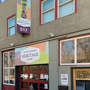
![]() The Heritage Center had a logo that was provided for free by a student years ago. It had an old-timey, wild west look that wasn’t helping the perception of the organization. The storefront wasn’t visible to people driving by, and even to those standing right across the street!
The Heritage Center had a logo that was provided for free by a student years ago. It had an old-timey, wild west look that wasn’t helping the perception of the organization. The storefront wasn’t visible to people driving by, and even to those standing right across the street!
“To further preserve, research, and interpret the history and culture of Manitou Springs and the Pikes Peak region” is the mission of the Heritage Center. Like most nonprofits, raising enough money to keep operating is the main challenge. The Heritage Center runs a free museum, sponsors Brewfest, and holds ghost story tours in October, among other activities. Inside the Center is an archive of historical documents and artifacts that can be researched for a fee.
The board decided to rebrand and communicated the following goals to me:
- Increase the visibility of the MSHC
- Communicate the mission consistently
- Get more people interacting with the Center and its events
- Create positive interactions with visitors
The audience includes Manitou residents and tourists, and to a lesser extent news media, history buffs, and local officials. The main objective was to show visually that the Heritage Center deals with old stuff, but it is a relevant, exciting place with passionate people.
I met with the stakeholders and we had a brainstorming session. We agreed that while the photos and artifacts in the Center were historic, everything else about the environment of the place should be modern and up to date. Graphics should represent the Pikes Peak region in a way that could be readily identified with.
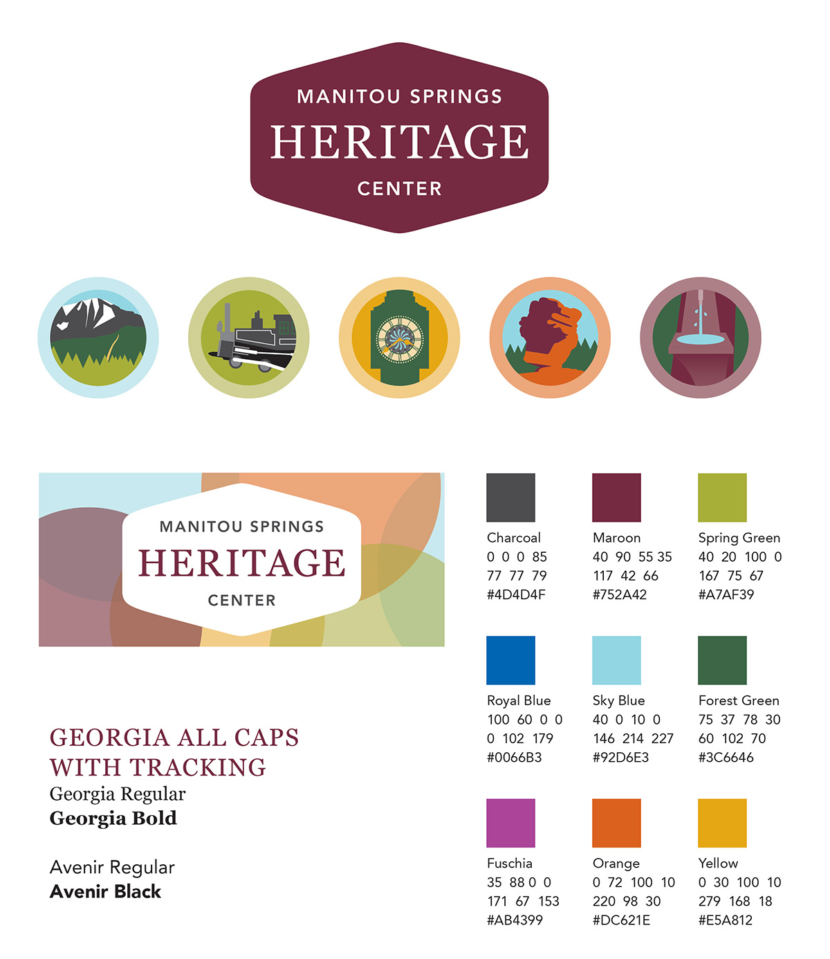 The new branding involves several modules:
- The logo itself in a modern typographic style on a marquee shape
- A color palette of fresh, natural colors
- Two background patterns
- A series of 5 illustrations of Manitou Springs landmarks: Pikes Peak, a cog engine, the town clock, Balanced Rock, and 7-Minute Spring
This system is eye-catching and identifiable as distinctly Manitou. When the brightly colored signs went up along Manitou Avenue, the rebranding was complete.
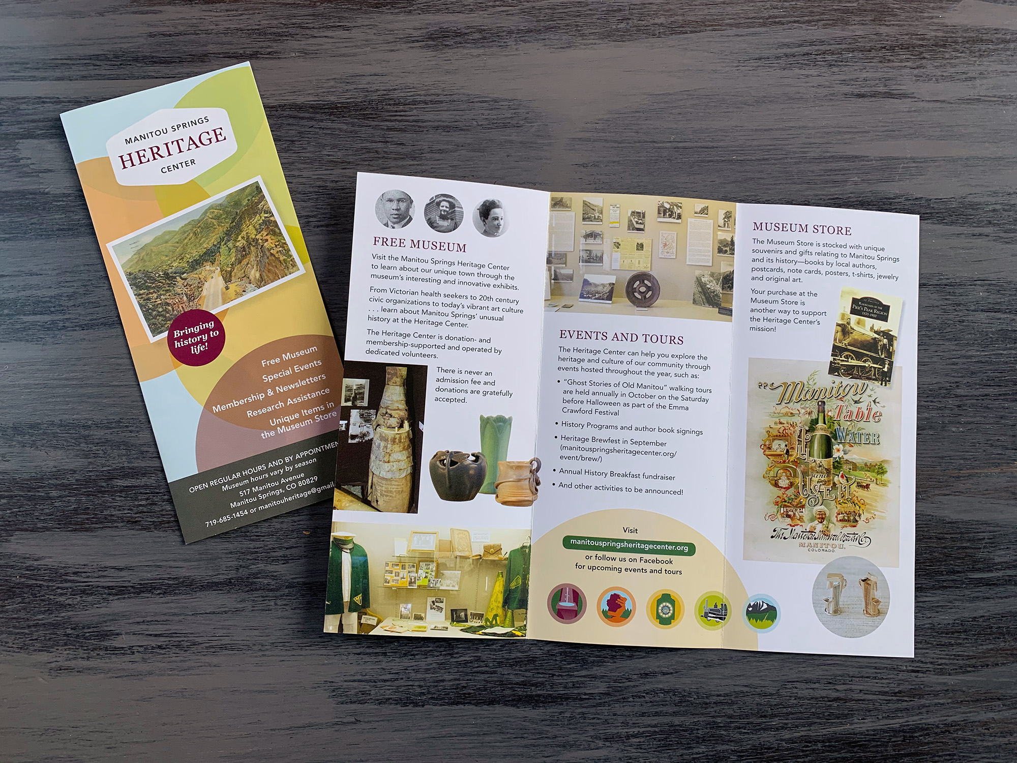
More people driving by are noticing the Center and stopping in. New brochures all over town tell the MSHC story with more images and fewer words. The Heritage Center staff is using the branding elements I provided to create their own collateral. A membership drive and capital campaign has resulted in the Heritage Center buying its building.