Aaron Robinson is an experienced Realtor whom I know well from my networking group. He is just about the friendliest guy you will ever meet, making his Friendly Robinson brand completely authentic. His goal is to build relationships first which naturally lead to sales.
A native of Colorado Springs, husband, father of three, and community builder, Aaron added the tagline “The Dad Realtor” to further differentiate himself. As a family man, he can relate to what families are looking for in a home.
Did I mention that Aaron always wears a suit and tie? This reflects his professionalism. Although he has a playful personality, he takes his business seriously. Working with Aaron is full of laughter and adventure, but he understands the importance of putting a family into the right house in a neighborhood where they will thrive.
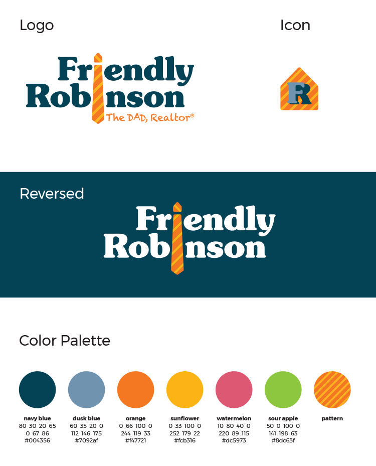
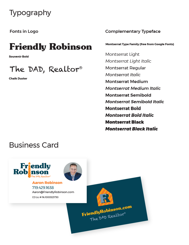
We decided on warm, vibrant colors for his palette, anchored by two shades of blue for credibility. A striped pattern is part of the visual language. The typeface is bold and casual. A tie is his symbol—note that the knot on top is shaped like a house.
As part of the full Studio 2D branding package, he received the logo in a number of variations and formats, an icon, social media banners and post images, and business cards. He also needed a yard sign (of course) designed.
Aaron is happy with the visual brand that reflects himself so well and differentiates him from competitors.

