Sometimes a logo needs a refresh to keep up with an evolving business. This is one of those cases. Bettina von Ruxleben, founder of Brodtmann Consulting, came to Studio 2D looking for a visual rebrand. (I had worked with Bettina on the Vivid Leaf logo and branding.) This was the old logo:
She wanted a logo that was elegant and polished enough to represent a mature, international business. A big part of her business is a suite of online products that she has developed, so the logo had to have a digital aspect.
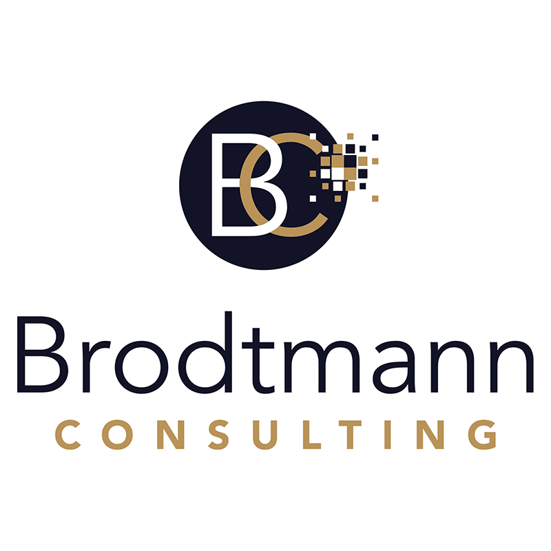
We went through many iterations, and her team members were involved with each stage to ensure full buy-in. In the end, they choose a logo that carried the circle and monogram from the old logo. The typeface is another clean sans serif. To that I added a burst of pixels. The new colors exude luxury.
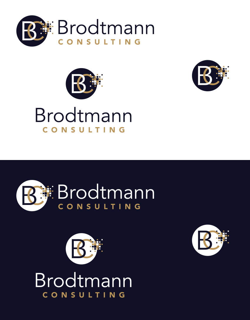
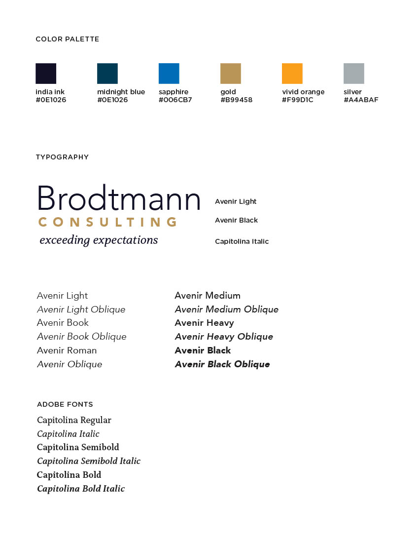
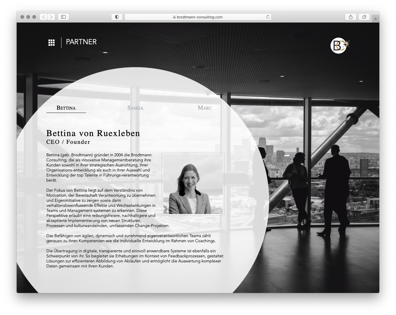
Below you can see the logo in its full array of options. Below that is a one-page style guide with a color palette and typography specifications. At the bottom is the logo in use on the new website, designed in-house.
The Brodtmann team took my vector file and had the logo animated for their website and some videos. The result is smashing.

