
Design Tips for Programmers
The line between back-end and front-end programming is not always distinct. Many times programmers have to make design decisions on the fly. This guide is intended to help avoid the worst transgressions. As with all rules, there are exceptions—but leave those up to the professional designers.
Spotlight on Paula Scher
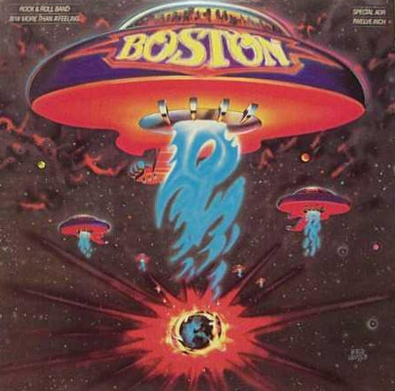
Do you recognize this album cover? In Make It Bigger, Paula Scher describes the design process that she oversaw as art director at CBS Records. She thought the idea of a guitar-shaped spaceship was “idiotic.” After a lot of back and forth with the band, the product manager, and the illustrator, the hit album of […]
How Do You Choose a Restaurant?

I’m good at picking restaurants. Long before Yelp I used my own method of choosing a restaurant based on its typography. My husband and I don’t like chains, even though you can be assured of consistency. In our travels, we’d rather throw the dice on a one-of-a-kind restaurant. When I find good typography on the […]
Web Fonts
When HTML first hit the scene in the early 1990s, web developers had no control over the fonts used on their pages. The web browser was entirely responsible for selecting fonts. Netscape introduced the <font> tag in 1995, giving developers the opportunity to choose their own fonts for the first time; the tag was incorporated […]
Pecha Kucha: Beautiful Typography
The more people learn about typography, the more they appreciate it. Watch my Pecha Kucha presentation on YouTube to learn a little about type history, get some professional tips, and see inspiring examples.
Hoefler and Frere-Jones
You may not have heard of them, but you have seen their work everywhere. For over 25 years Jonathan Hoefler and Tobias Frere-Jones have designed typefaces for the world’s most iconic brands, publications, and even political candidates. During their partnership (which has ceased as of January 2014), the two produced some of the most ubiquitous […]
Rules of Typography
Follow these rules if you want your publication to look professional, be easy to read, and reflect well on you. When in doubt, consult The Chicago Manual of Style. Insert one space after all punctuation. If you learned to type on a typewriter, you were taught to insert two spaces after each period, semicolon, question […]
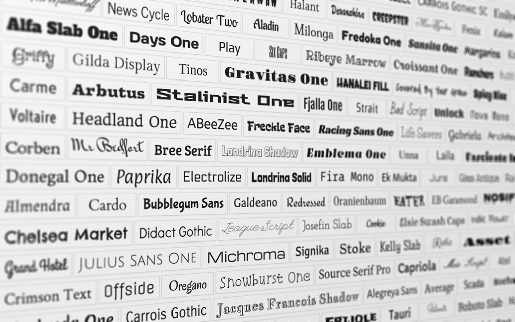
Do You Know What a Font Is?
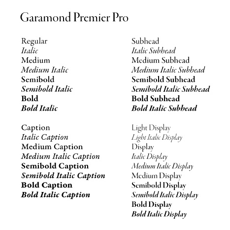
typeface: an artistic design for letterforms A typeface represents a consistent visual appearance for letterforms. A typeface might be produced as a single font, or a family of various weights and styles. The Garamond Premier Pro typeface is depicted above.