You may not have heard of them, but you have seen their work everywhere.
For over 25 years Jonathan Hoefler and Tobias Frere-Jones have designed typefaces for the world’s most iconic brands, publications, and even political candidates. During their partnership (which has ceased as of January 2014), the two produced some of the most ubiquitous typefaces of our time.
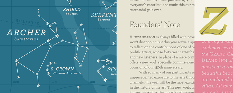
Keep an eye out for Archer and you’ll likely spot it the next time you flip through a magazine. You’ve probably seen more than one blockbuster movie use Gotham for its title. And you may even recognize Whitney as the “museum font.”
A well-chosen typeface can evoke as much interest as the text itself. That’s why smart companies trust professionals to design and select typefaces that harmonize with their marketing goals.