
10 Rules for Designing a Logo
I have been designing logos for decades. Great logos have some basic principles in common. Here are my 10 rules for designing a logo.
Proximity
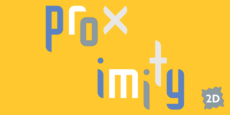
The proximity principle: elements that are close spatially are perceived to belong together. Use this to your advantage. Things that are close together will appear to be grouped. This is why you should not space out everything on your page equally. Create groups of meaning. Your audience will have a much easier time comprehending information […]
Outlines, drop shadows, and gradients, oh my!
What makes a good logo? In my opinion, simplicity, appropriateness, and uniqueness. I drive around town and see many poorly designed logos. Some are too complex, some don’t reflect the business appropriately, and some are clichés.
Design Principles: Texture

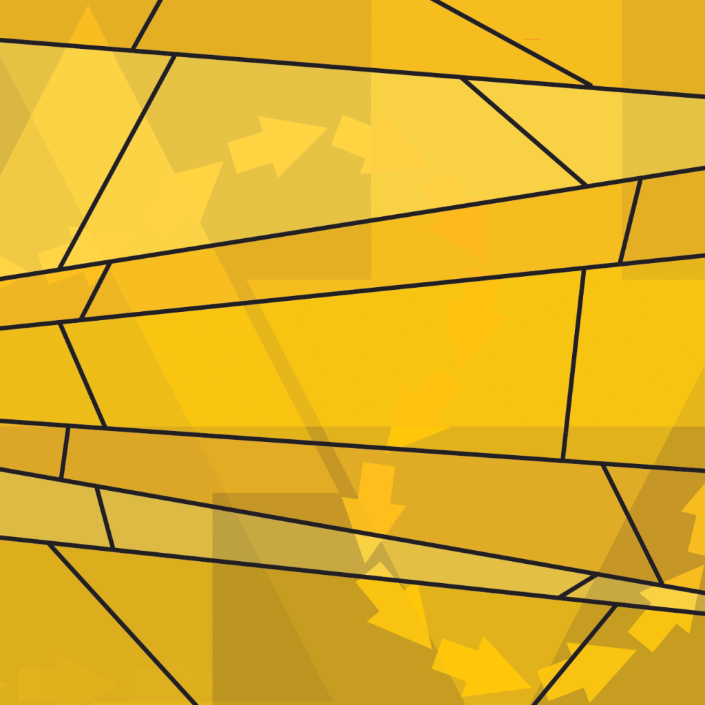
A subtle and often overlooked design principle is texture. Derived from the Latin word meaning “to weave,” texture arises from interwoven or layered parts.
Design Principles: Rhythm
Rhythm establishes consistency in your design. Repeating elements operate like the bass line in a good tune. Rhythm can create movement through a multi-page publication and help your viewer navigate.
Design Principles: Balance

You know how important balance is in life. Balance is also a fundamental design principle.
Design Principles: Emphasis

What if a movie had no climax? A news article had no headline? A song had no refrain?
Design Principles: Unity
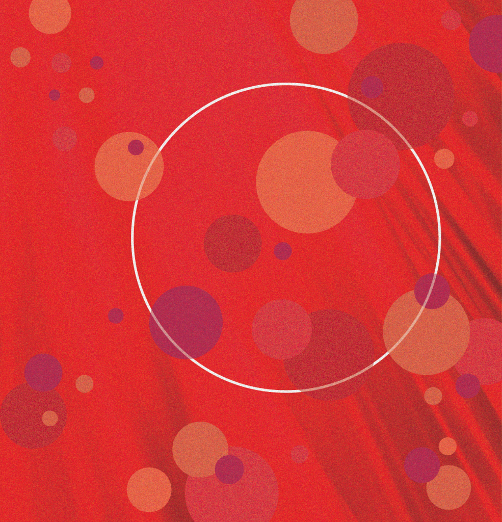
One of the most basic design principles is unity. Unity brings diverse elements into a cohesive whole. The image above is unified by color and shape. Think of unity as getting every element to work together for a purpose. Red is the color of excitement, energy, action, and power. Circles are endless. A circle represents […]
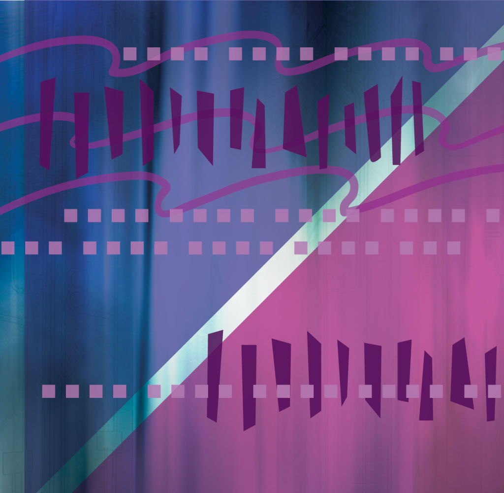
Design Principles: Line
Lines can be delicate or aggressive, directional or meandering, representational or abstract. Lines do much more than delineate a shape. They have rhythm. They have motion. They can fill space, enclose space, or create negative space.
Negative Space
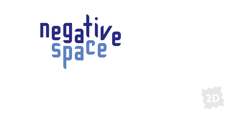
Let’s talk about white space—or more accurately, negative space, because it doesn’t have to be white.