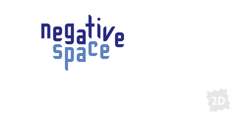
Let’s talk about white space—or more accurately, negative space, because it doesn’t have to be white.
It’s tempting to fill all available space with words. Ironically, the more you cram on a page, the less likely it will be read. Negative space says, “I am so confident, I don’t need to shout.”
Strategic use of negative space exudes sophisticated calm. It gives eyes a place to rest. By removing clutter, what is left gets more emphasis.
 This manual I designed for an executive leadership program is an example of negative space, appropriate for the audience. By placing only the logo and title on the cover, they get all the attention. This kind of restraint is what you will find in upscale design.