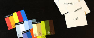
With only a split-second glance, color can convey a memorable message. Color speaks to us by instantly evoking physiological reactions and cultural associations. Utilizing the ideas we link to colors helps a designer build a brand identity. So how do we describe colors and combine them into the message we want to send?
Any color can be described with a few basic terms: hue, saturation, and value. Hue is just another word for color. Red, blue, and yellow are hues. Saturation is the color’s intensity. Saturated colors are vibrant and rich, while desaturated colors are grayed and muted. Value describes whether a color is light or dark. When white is added to a hue, it’s called a tint. When black is added, it’s called a shade.
Nearly infinite color combinations can inspire multitudes of viewer responses. All of the combinations break down into four basic color schemes, each communicating a different set of qualities.
Monotone schemes use values of one neutral color, for example gray or taupe. They are understated and low contrast, imparting class and quality. Monochrome schemes include values or intensities of a single hue. They draw the viewer in with subtle nuances.
Analogous schemes combine hues that lie side-by-side on the color wheel. For example, magenta, violet, and indigo: hues related to purple which span from slightly red to slightly blue. These schemes are always harmonious. Expanding the group to include many hues increases visual interest.
Complementary schemes combine hues that lie opposite each other on the color wheel. Orange and blue, red and green, yellow and purple, these combinations make a big impact. From sports teams to snack foods, those using complementary schemes demand attention.
Each color scheme is fined-tuned by the selection of hues, intensities, and values. Complementary schemes become sophisticated using deeper shades. Monochrome schemes can shock with a powerful, saturated hue. The variations are endless, so pinpointing the right colors is challenging. But the result, if done right, is representative of a brand in a way words alone can never be.
(Reference: Pantone Guide to Communicating with Color. Leatrice Eiseman, 2000.)