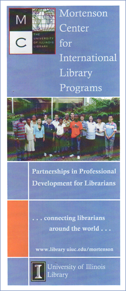
This is a real world example of the creative process at work. I was asked to design a new logo and identity for the Mortenson Center, a librarian development organization within the University of Illinois Library. This is their previous logo as shown on a brochure:
 I met with Barbara Ford and Susan Schnuer, the directors. The goals for the redesign were to look less academic, more crisp and cutting edge. The logo needed to reflect an international organization with a 20-year track record of excellence. If possible, some connection to the existing logo should be incorporated. They favored bright colors and achieving a “wow” factor. Some things to avoid: books, buildings, and computers. This is a people-oriented organization. The logo needed to be active, not reflective or analytical.
Barbara and Susan had an example from another organization that they liked. In my research phase, I did not find any organizations similar to the Mortenson Center that had an impactful visual identity.
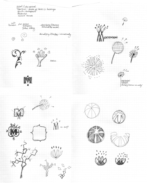
With the above parameters in mind, I began to sketch. I was trying to show organic growth and the “seeding” effect that librarians who went through this program would have. Note that I am not yet using color, only form. This is four pages of sketches:
The next step is to go to the computer and render the ideas with the most potential. Logos should always be drawn with vectors so that they are infinitely scalable.
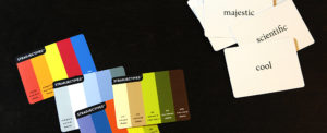
First I set up my color palette. Colors all have connotations and evoke emotions. When combined, colors affect each other in complex ways, either multiplying or mitigating. Notice that Illini orange and blue are included. Here is the palette I used:
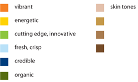
Then I developed a type treatment. Every typeface has a personality. Like colors, typefaces can be combined to either magnify or complement each other. I wanted “Mortenson Center” to be modern and elegant. All caps gives it authority. The rounded script underneath adds a human touch:
Combing the color palette, type treatment, and ideas from my sketches, I arrived at the following options that I presented to the clients:
![]()
I offered a variety of color combinations to see what they would respond to. I also offered the following supplemental graphics that could be used with the logo:

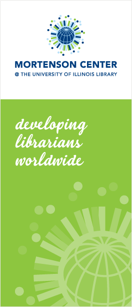
Barbara and Susan like the dandelion design, but wanted to add a globe in the middle to transition from the previous logo. They also wanted to include the University of Illinois Library in the logo, and use the @ symbol to imply connectivity. They liked the blue-green color combination with no skin tones. It is crisp, innovative, and credible. The way the outer circles are randomly placed gives it active motion.
A note about the inspiration for this design: I liked the dandelion idea, and if you scroll back you’ll see it in the sketches. I wasn’t sure how to make the dandelion seeds look like people until I was on the beach in Florida looking at the Naples pier. I saw a long line of people of all ages, shapes, and sizes, and I saw that the basic human shape and proportion is strikingly similar.
This is the final logo. Below is the new brochure.
![]()