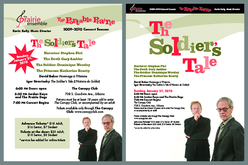
White space—or more accurately, negative space—is an important part of any design. In another post we talk about grids and how they are the underlying structures. Content is aligned to the grid. Furthermore, things that belong together are close in proximity; things that are different are separated by space.
Avoid spacing everything evenly on the page. It’s boring and confusing. Your viewer doesn’t know where to look. What is most important? How should interest flow through the page? Managing negative space is the key.
Negative space should generally fall on the outside of your design rather than being trapped in the middle. In the example below, see how much stronger the poster is when negative space is used well.


