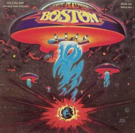
Do you recognize this album cover? In Make It Bigger, Paula Scher describes the design process that she oversaw as art director at CBS Records. She thought the idea of a guitar-shaped spaceship was “idiotic.” After a lot of back and forth with the band, the product manager, and the illustrator, the hit album of 1976 was released with this cover.
Scher’s book tells the story of her career as one of the most well-known designers of our time. She candidly describes how politics, personalities, whims, and luck affect the design that is ultimately produced.
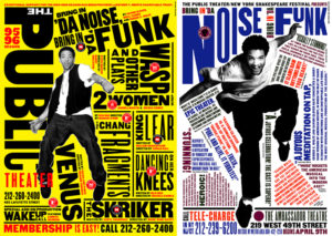 One of Scher’s strengths is her deep knowledge of design and typographic history. One of her weaknesses is her inability to handletter neatly. With the advice of a professor, she turned her weakness into a strength by illustrating with type. Her type moves, even dances. Much more interesting than type set neatly on a straight line.
As a New York designer, Scher found her way to Pentagram in 1991. Pentagram has a unique structure that allows its designers to operate as the principal of a small firm, but with all the support and infrastructure of a large international firm.
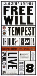 Her work for The Public Theater was some of the most innovative and satisfying of her career (above and right), mostly because of her sympatico working relationship with the director George C. Wolfe. Together they developed a brash, populist identity that eventually became synonymous with New York City itself.
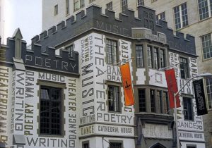 Her makeover of the New Jersey Performing Arts Center (left) is another notable project. From a depressing, 1940s era building, on “virtually no budget,” she transformed it into an inspiring place to study the performing arts. The interior was recast as well, using standard, institutional tile and paint in bold patterns.
Scher’s career was driven by the desire to design, to design well, and to challenge the “normal” way of designing things. Along the way she learned a lot about corporate structure, marketing, psychology, developing trust, and breaking barriers.
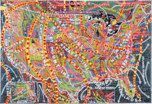 Lately, Scher has been painting freeform maps of the United States (right). Are they art? Or complex infographics? They are another creative expression from Paula Scher.
Watch this video interview with Paula Scher (7 minutes) to hear her in her own voice and see more examples of her work, including her redesign of the Citi logo when they merged with Travelers. The logo design took her 1 minute and 34 years.
* * *
“The things designers design may be powerful, provocative, funny, obsessive or elegant. But they are all created with the express purpose that other people will use them in some way.” —Paula Scher

