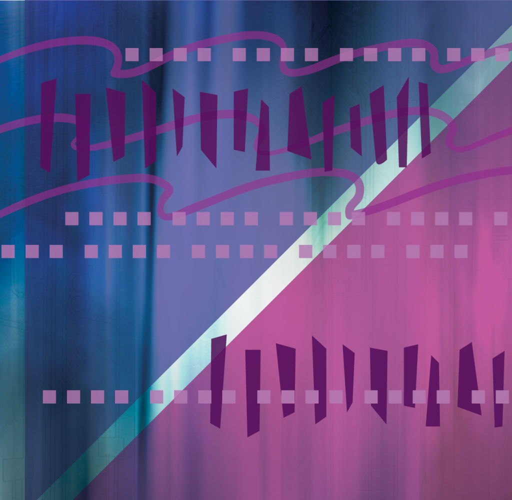
Rhythm establishes consistency in your design. Repeating elements operate like the bass line in a good tune. Rhythm can create movement through a multi-page publication and help your viewer navigate.
In long publications, the rhythm of headings, footers, and graphic elements are essential. Readers need to know what section they are in, what chapter or article, and when the topic has changed. They need a sense of where they are in the publication as a whole.
Pull quotes, captions, and subheads are repeating elements that break up dense material and help a reader skim. Once a reader starts skimming, you want to have eyecatching graphics to pull them back in.
Humans respond to rhythm because life is made of it: your heartbeat and breath sustain you continuously. Daily routines, seasons, and holidays give us rhythms that create a time slot for everything important. Expert designers know how to tap this powerful force. While amateur publications have a scattershot appearance, professional publications hook the reader to keep them turning the pages.
If you have important information to express, your magazine, book, or website deserves a top notch graphic designer.


