The proximity principle: elements that are close spatially are perceived to belong together. Use this to your advantage.
Things that are close together will appear to be grouped. This is why you should not space out everything on your page equally. Create groups of meaning. Your audience will have a much easier time comprehending information when you group it.
One simple application of the proximity principle is to insert twice as much space above a heading as below it. That way, the heading is clearly closer to the paragraph that it belongs to.
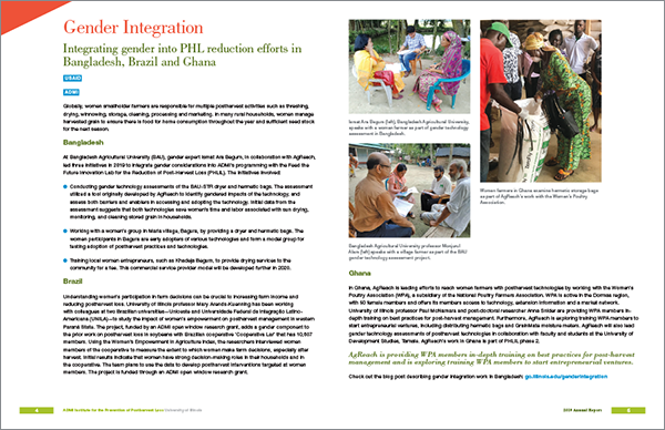
In this example, the 2-page spread has everything spaced evenly.
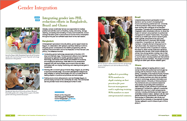
After applying the proximity principle, the layout is more dynamic and easier to comprehend. Captions are closer to the photo they belong with. Photos are close to the section that relates to them. Headings are closer to the paragraph below. The quote is next to the paragraph it is pulled from. The link to more information is separated into its own island where it can’t be missed.
The law of proximity reflects the way our perception as humans developed. Knowing and using design principles helps to communicate more effectively.


