What makes a good logo? In my opinion, simplicity, appropriateness, and uniqueness. I drive around town and see many poorly designed logos. Some are too complex, some don’t reflect the business appropriately, and some are clichés.
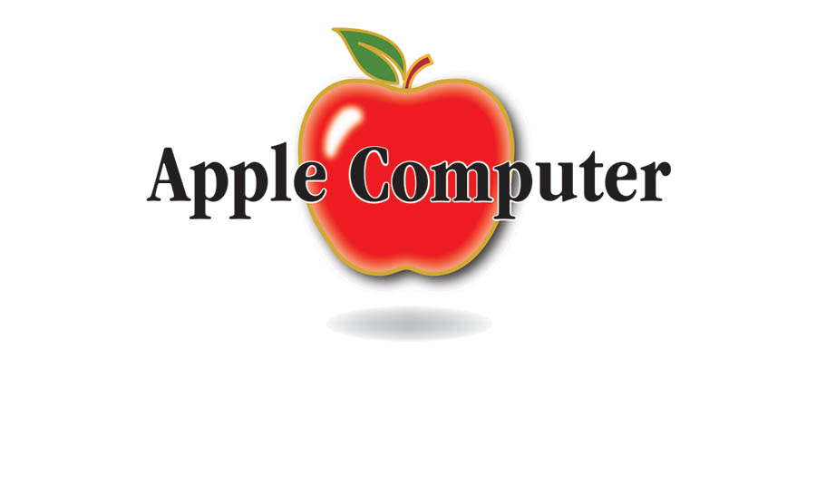
As an example, the logo above is from a fictional little computer company. Can you spot the giveaway signs of an unprofessional logo? Let’s start with artificially condensed type: With thousands of fonts available, it is possible to find a condensed font that will work beautifully.
Below I have substituted Garamond Bold Condensed. The name of the company no longer looks distorted. Next problem: Badly mixed fonts. Fonts can be mixed tastefully and with purpose, but random choices betray ignorance of typography.
OK, in the revision below, at least all the fonts are from the same typeface. Next problem, the logo includes the business entity. Do not include Inc. or LLC as part of the logo. It is not legally necessary and makes the company look like small potatoes because major brands don’t do it.
This is better, but it still looks busy. This logo has not one, but two taglines. Taglines might be necessary for a lesser known business, but taglines don’t hold up well when the logo has to be used small.
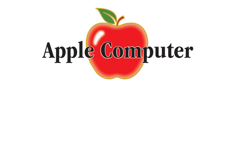
In the image below I have ditched the taglines. Drop shadows are a problem because they make it nearly impossible to put the logo on any color but white. Dark shadows like this one look muddy.
OK, much cleaner. Now we will deal with my biggest pet peeve: outlined type. Outlining type distorts the letterforms and adds unnecessary complexity. An amateur is tempted to add outlines when there is not enough contrast. Remove the outlines and fix the contrast instead.
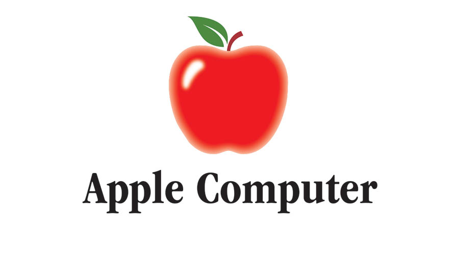
Below, the outlining is gone from the type and the image. One more issue to deal with. Gradients and other special effects might be trendy, but beware. When special effects are added to a logo in sloppy manner they are tacky.
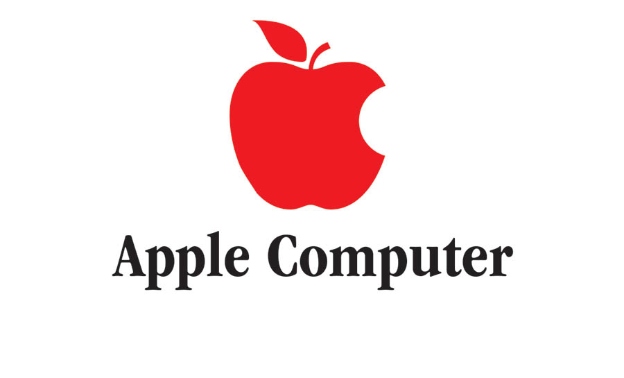
Here the apple has been further simplified. A visual pun of the word “byte” has been added to make it unique and recognizable. The final image completes our makeover.
A mature company that has developed a world-class brand can eventually drop everything but the symbol or mark. It takes years to reach this level, and all logos evolve over time. In my career I have designed dozens of logos from scratch and updated many more. I try to keep them simple, appropriate, and unique.


