I’m good at picking restaurants. Long before Yelp I used my own method of choosing a restaurant based on its typography. My husband and I don’t like chains, even though you can be assured of consistency. In our travels, we’d rather throw the dice on a one-of-a-kind restaurant. When I find good typography on the outside, I always find good food on the inside. I’m sure that’s because the same attention to detail permeates the entire business.
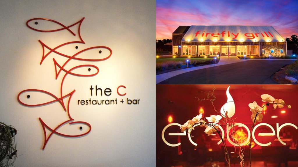
Our favorite is the C restaurant + bar. It’s a seafood place in Monterey, California. First, we loved the letter C standing in for the word. Second, the school of fish, drawn with one continuous line was clever. We were certain that the food would be good, and we were not disappointed.
Firefly Grill is in Effingham, and we drive past it every time we go to Southern Illinois for rockclimbing. The cool typography attracted us, and we finally started timing our trips to arrive in Effingham at lunch time, or dinner time on the way home. Once again, the food was on par with the sign, i.e., fantastic.
Ember is a little place in Breckenridge, Colorado, and we walked past it early in the day and made a note to come back in the evening based on the sign out front. It looked warm and cozy with playful typography. I had the best soup of my life there. No joke. We were invited to meet the chef, who hugged us.
The lesson, my friends, is that good typography will not steer you wrong.


One Response
I love Breckenridge, Colorado! Havent’ been back for YEARS…but I will definitely check out Ember per your recommendation when the time comes!