The line between back-end and front-end programming is not always distinct. Many times programmers have to make design decisions on the fly. This guide is intended to help avoid the worst transgressions. As with all rules, there are exceptions—but leave those up to the professional designers.
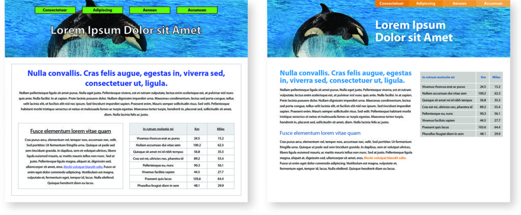
The image above shows before and after applying some of these rules.
Use flush left alignment by default
Flush left alignment will immediately look neater and cleaner. If you center something or indent it, do it for a good reason.
Never outline type
Outlining type distorts the letterforms. If you can’t read something over the background image or color, increase size or contrast instead. It is rarely a good idea to put type over a photo. In the example here, recropping the photo opened up a good space for the type.
Do not outline shapes
If you can’t see something without an outline, increase the contrast instead. If you outline something, have a very good reason.
Avoid tables
Tables don’t work well in responsive layouts. If a tabular format is best for your content, use left alignment as much as possible. Keep the table itself simple, with cell borders that match the background color.
Only underline links
Users expect underlined text to link to something. Do not underline a head or anything else for emphasis. That being said, there are more beautiful ways to indicate links than underlining. A bold font with a distinct color is a nice option.
Adjust your line-heights
The bigger the type size, the smaller the line-height. For most headings, the line-height will equal the font-size. (Designers call this solid leading.) Don’t always default to auto-leading.
Use more space above a head than below it
Objects should always be closer to related objects than unrelated objects. The space above a heading should be twice the space below. As a rule of thumb, margin-top = 1 em and margin-bottom = .5 em. Space after paragraphs and lists should also be adjusted to .5 em.
Do not indent lists
Write custom css to align your lists neatly under the paragraph above instead of allowing the default indent.
Do not nest boxes
Boxes inside of boxes creates unnecessary complexity. Only box something if it really needs to be set apart in that way.
Watch your line lengths
When your content div goes all the way across a page, lines of text can be hard to follow. The ideal line length is between 45 and 75 characters. Divide your text area into narrower columns to achieve optimal line lengths.
Use a consistent color palette
Choose your color palette in advance. Many websites exist to help you come up with a pleasing and professional palette. Put each color name and hex code in a comment at the top of your style sheet for reference.
Ways to add emphasis
- Make it bigger is only one way
- Make it bolder
- Add contrast by changing color or font
- Isolate it (surround with white space)
- Change the shape—if everything is rectangular, a round shape will stand out
- Change the texture
Advanced: Use proper en and em dashes
Use an en dash to show a range, such as 8 am–5 pm. Use an em dash to show a break in thought—and no spaces around dashes please.

