The most obvious sign of professional design is the use of alignment. Invisible axes give structure to a page.
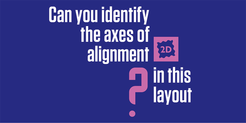
Whether you are designing a business card, flyer, or billboard, every element on the page should be placed with intention. Intention is part of the definition of design. To help with that, designers use grids: invisible scaffolding that helps with alignment. In the example above, there is one vertical and one horizontal axis. The simplest structure of all is one vertical axis right down the middle. But that’s boring, so designers create grids with as much complexity as necessary for the project.
When designing a magazine, I might use a 7 or 12 column grid. That allows plenty of flexibility for each page to have a unique and interesting layout, but still gives unity to the publication as a whole. You can’t see the underlying grid, but you do feel the rhythm that it provides.
Violating the grid is a way to draw attention to something on the page. You eye is drawn to contrast. When one thing doesn’t fit properly, you see that first.
Helter skelter placement looks chaotic and gives an unsettled feeling to the viewer. Keeping your text blocks and images aligned to a grid helps the reader’s eye move through the page easily.

