I have been designing logos for decades. Great logos have some basic principles in common. Here are my 10 rules for designing a logo.




1. Keep it Simple
Logos have to look good in all sizes across all media, so simple is better. Simplicity radiates confidence. Your logo doesn’t need taglines, business entities, or other complications.
2. Avoid Outlines, Drop Shadows, and Metallic Effects
My logo designs don’t have outlines, drop shadows, metallic effects, or gradients (with rare exceptions). Find out why.3. Make it Unique
I worked with Dr. Tara Alexander who is a business communication coach. She tried to do her branding herself using online templates and was unhappy with the results. She was using a clip art tree that had intertwined roots, and we both liked the symbolism of that, but the tree needed to show the beauty of diversity. This tree is totally unique.
4. Draw with Vectors
Even if the logo has some intricate shapes, it must be drawn with vectors. A vector image can be enlarged or reduced to any size without losing resolution. If artwork is done in Photoshop you can’t enlarge the logo without it getting fuzzy or pixelated.
5. Choose the Right Typeface, and Modify as Appropriate
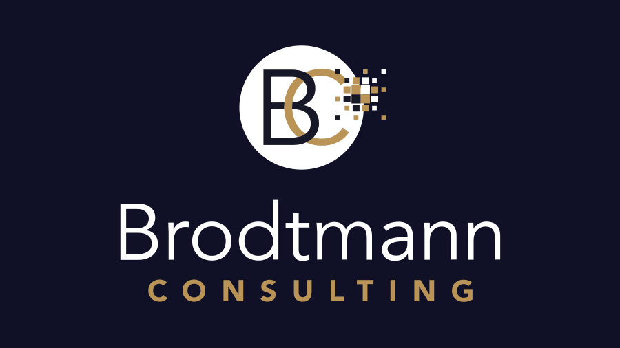
Every typeface has a personality. I have made friends with many, many typefaces so I know who is going to be best for the job. Avenir is elegant and sophisticated and perfect for this international consultancy. The B in the circle is modified—it is elongated slightly to make space for the interlocking C.
6. Choose Colors to Communicate
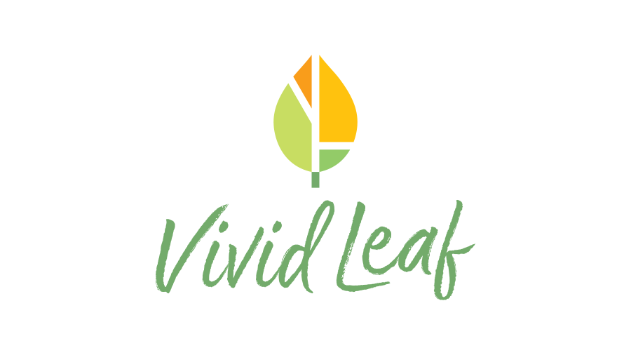
Colors have meaning. They evoke emotions. The best branding systems use colors that are chosen for what they communicate to the outside world. For that reason, I developed Stradjectives™, a deck of cards to choose colors by adjectives. Vivid Leaf is an environmental sustainability company that has a positive, uplifting mission. These natural and bright colors are appropriate.
7. A logo must look good in one color
Even though the Aha! logo gets a lot of its oomph from the colorful gradient fill, it still looks good in one color. All logos will sometimes appear on black or colored backgrounds. That’s another reason it must be drawn in vectors. The logo file must have a transparent background so it can be placed on a color.
8. Keep the ideal customers top of mind and design for them
I designed this logo for Trent Denman’s leadership coaching company. He is serving motivated professionals who aim for lofty goals. The symbol of a mountain peak speaks to them. He recently told me he still loves his logo.
9. Identify—Don’t Explain
Logos can be purely typographic or abstract. The logo over time picks up all the feelings that people associate with it. This logo for Dependable Professional carpet cleaning and restoration service doesn’t try to explain everything that they do. In fact, my client asked me to move from the full name to simply DP. Easy to say, easy to remember, easy to refer.
10. Finally, There are Exceptions to Every Rule
This logo for Meadowland Health has outlines and lots of details. That goes against Rule Number One! But it works, even in small sizes. The somewhat realistic sunflower in an engraved style gives a historic feeling to a brand new company.
Your Logo is Not Your Brand
Your logo represents your brand. Ideally, a creative and strategic process goes into the design of the logo. For more insight into how a professional designer does this, use the form below to order a complimentary pdf copy of my Growing a Beautiful Brand booklet. Owners of new and existing businesses will enjoy clarifying their ideal customer, their why, their message, and more.
You will be added to my email list and receive between 2 and 6 communications from me each year. Unsubscribe any time.


