“All colors are the friends of their neighbors and the lovers of their opposites.”
—Marc Chagall
Colors evoke emotions. Advanced use of color takes advantage of the following characteristics to set just the right mood.
Hue is another word for color. See Basic Color for descriptions of individual hues.
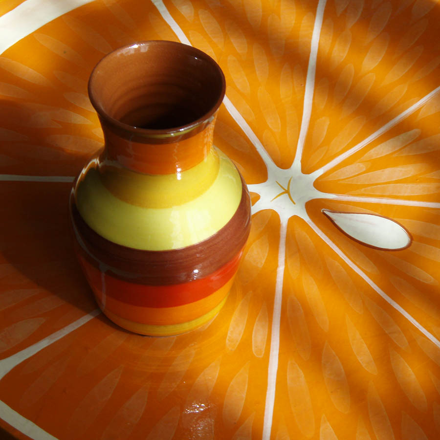
Saturation describes a color’s intensity. Highly saturated colors are bright, vivid, or true. They are playful and festive. Less saturated colors are muted, dusty, or low key. They are relaxing and unobtrusive.
Value describes the lightness or darkness of a color. Tints are lightened hues, and are used for a delicate, wistful, or romantic look. Shades are darkened hues, and are used for a robust, traditional, or strong appearance.
Harmonious or analogous colors are the friends that Marc Chagall refers to in the quote above. Combining colors that are related multiplies their common characteristics.
Complementary colors are the opposites that attract. They enhance and intensify each other, creating energy, excitement, and passion. The more saturated the colors, the more attention they command.
Temperature. Warmth is generated by reds, oranges and yellows. Coolness is evoked with blues, greens, and violets. Temperature can be contrasted, for example, by putting a red object on a cool aqua background.