You know how important balance is in life. Balance is also a fundamental design principle.
Every object in a composition has visual weight. Heavier objects cause your eye to gravitate towards them. When a design is unbalanced, one object might hold your attention captive. Or everything might feel jumbled, random, and chaotic. A balanced design allows your eye to comfortably flow across all objects on the page.
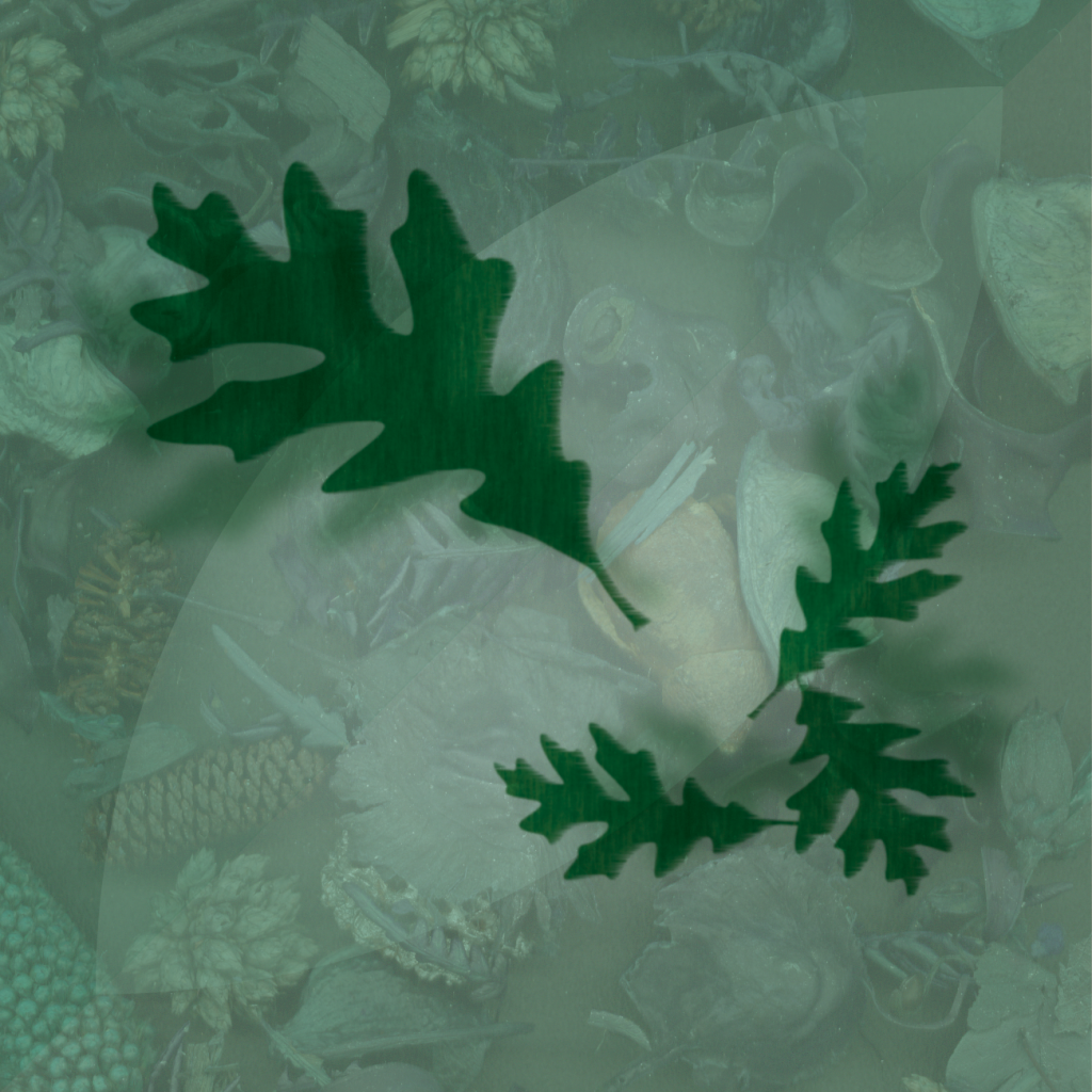
Many properties affect the visual weight of an object, including size, color, texture, shape, position, and contrast. In the above illustration, one large leaf is the focal point, and it is balanced by the combined weight of the other three.
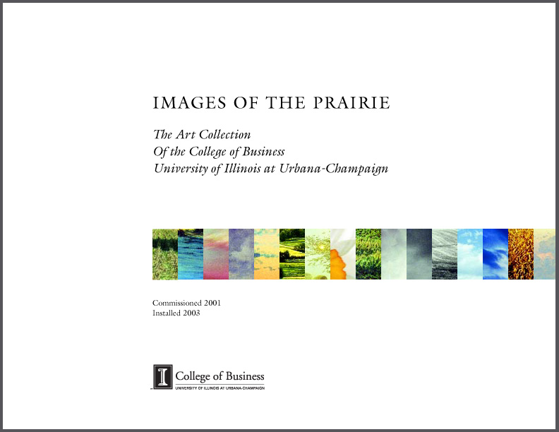
The easiest way to achieve balance is to center everything right down the middle. Symmetry creates stability. But for a dynamic layout, use asymmetrical balance. The cover design on the left is a symmetrical design, while the one on the right is asymmetrical. Notice how your eye stays in the center of the first cover. In the second, your eye travels from the top down, then to the right, then back again.
Use an unbalanced composition when you intentionally want to make your viewer feel precarious.